
Part 3: Using Silhouette Score to Choose the Right Number of Clusters in Time Series Clustering
How silhouette score reveals the optimal number of clusters in shape-based time series clustering

If you’ve read Parts 1 and 2, you’ve seen why many time-series clustering pipelines fail:
Euclidean distance optimizes numeric proximity, not shape
Correlation distance captures behavioral similarity
Visual inspection (heatmaps, PCA) reveals structure — but isn’t enough on its own
If you’re joining here directly, Parts 1 and 2 show why distance-metric choice matters more than the clustering algorithm when your goal is shape-based time series clustering.
In this final part, we make the process quantitative and defensible using silhouette score.
This is the step that turns clustering from an art into a repeatable system.
Silhouette Score for Time Series Clustering: What It Measures
Silhouette score answers two questions simultaneously for each time series:
Cohesion (a)
How close is this series to others in its own cluster?
Separation (b)
How far is it from the nearest competing cluster?
The silhouette score is defined as: (b−a)/max(a,b)
Interpretation:
close to +1 → well-clustered
close to 0 → ambiguous
negative → likely misclassified
Silhouette score is one of the most reliable ways to choose the number of clusters in time series clustering, provided the distance metric is aligned with the problem.
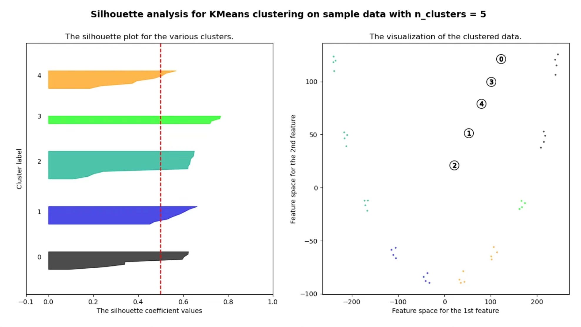
Why Euclidean Distance Fails Silhouette Analysis in Time Series Clustering
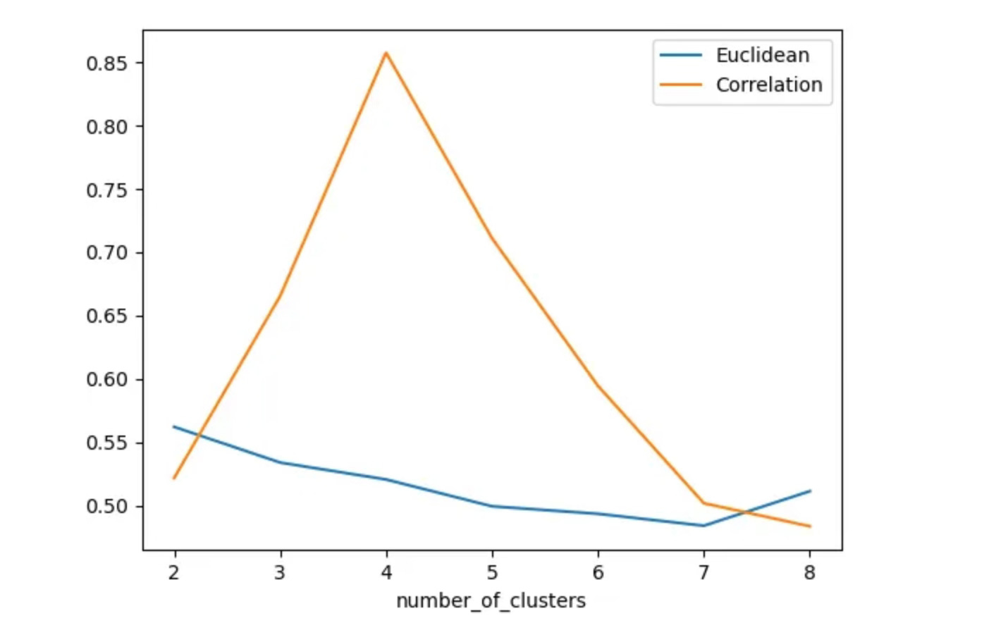
We first compute silhouette scores across different cluster counts using Euclidean distance.
The results are consistent:
silhouette scores remain low
clusters overlap heavily
no clear “optimal” number of clusters emerges
This quantitatively confirms what we observed visually in Parts 1 and 2.
The issue isn’t the clustering algorithm.
The distance metric itself is misaligned with shape-based similarity.
Euclidean distance
Correlation
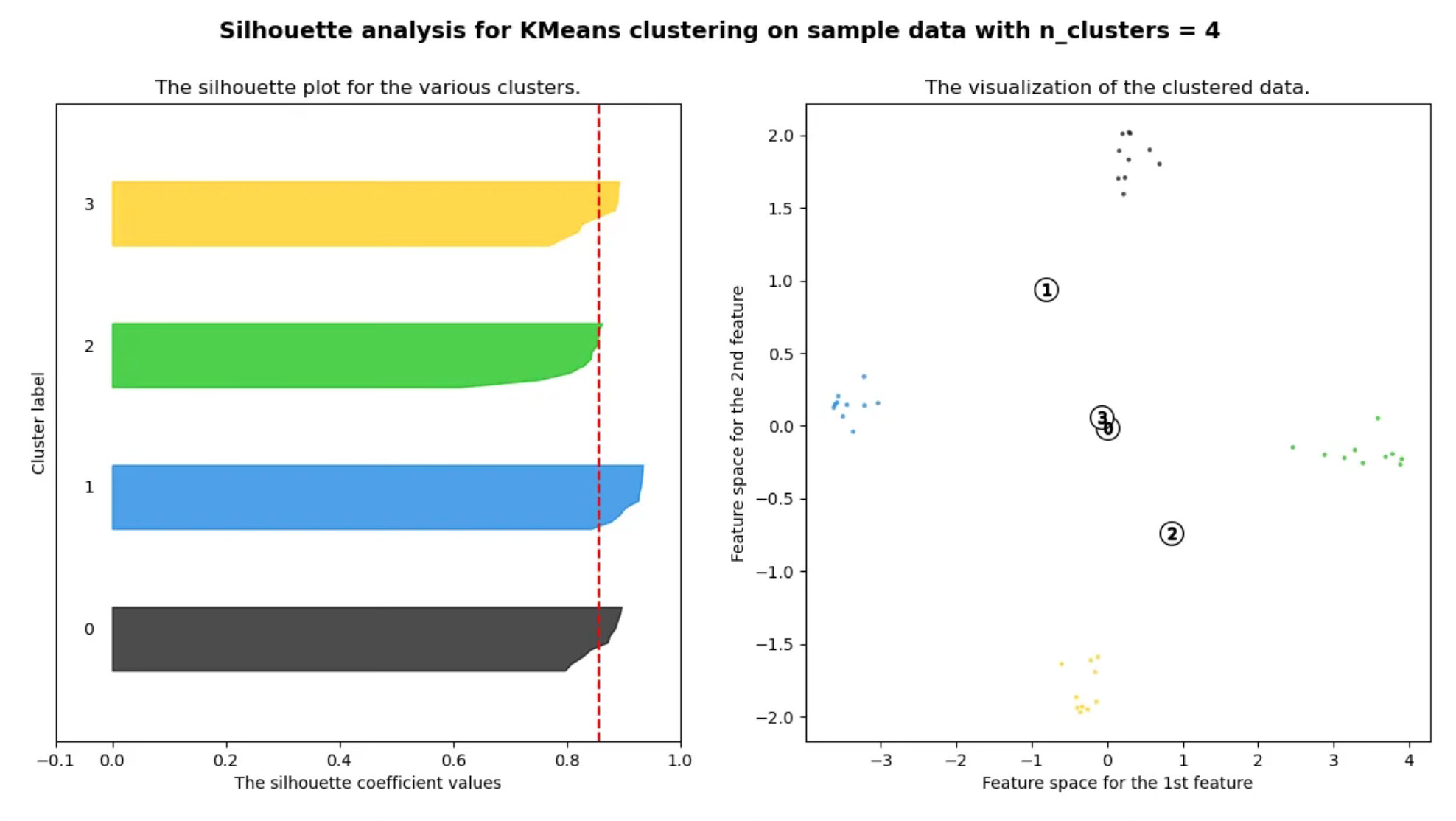
Correlation Distance and Silhouette Score: Clear Signal, Clean Separation
Repeating the same analysis using correlation-based distance produces a very different outcome:
silhouette score peaks sharply at 4 clusters
PCA visualizations show clean separation
clusters align with the underlying waveform types
This is what effective clustering looks like:
interpretable
stable across runs
measurable with objective metrics
Key takeaway:
In shape-based time series clustering, correlation distance enables silhouette score to surface a clear, defensible cluster structure.
How to Use Silhouette Score for Shape-Based Time Series Clustering
A simple, repeatable workflow:
Choose a distance metric aligned with shape (e.g., correlation distance)
Compute silhouette score across candidate cluster counts
Select the cluster count where the score peaks and stabilizes
Validate results visually (heatmaps, PCA)
Used together, metrics + visuals provide confidence — neither works well alone.
Final Takeaways
Time-series clustering success depends more on distance definition than algorithms
Correlation-based distance is ideal when shape matters more than scale
Silhouette score removes guesswork from cluster selection
Visual diagnostics and quantitative metrics must be used together
At this point, many clustering pipelines still fail — not because the math is wrong, but because silhouette score can produce deceptively clean results in real-world data.
Knowing when not to trust a high silhouette score is the difference between exploratory analysis and production reliability.
🔒 Production Heuristics: When Silhouette Score Lies (Subscriber-Only)
The sections above show how to use silhouette score correctly.
This section focuses on when it fails in practice.
For paid subscribers, I share the experience-based rules I rely on in real production time-series systems, including:
when silhouette score gives false confidence
how correlation distance can artificially inflate separation
red flags that indicate over-clustering
cases where clustering should be abandoned entirely
decision rules for treating clusters as exploratory vs production-grade
These are the failure modes most tutorials never cover — and the ones that matter most once clustering outputs feed downstream decisions.
👉 Available to paid subscribers on Substack
Closing Note
This series is adapted from my original Medium write-up, but extended with clearer structure, stronger diagnostics, and production-focused judgment you won’t find in most introductory tutorials.
If Parts 1–3 helped you reason more clearly about time series clustering, the subscriber-only section is where that reasoning gets stress-tested against reality.