
Part 2 - Correlation vs Euclidean Distance: Seeing Time Series Similarity the Right Way
Why Euclidean distance fails and correlation distance reveals true structure in shape-based time series clustering

If you followed Part 1, you already know the core mistake most time-series clustering pipelines make: optimizing numeric proximity instead of shape similarity.
In this part, we make that failure visible.
Instead of guessing, we compute and compare pairwise distance matrices using two approaches:
Euclidean distance
Correlation-based distance
This is because In time series clustering, choosing the right distance metric is often more important than the clustering algorithm itself. This post compares Euclidean distance vs correlation-based distance for shape-based time series clustering, using distance heatmaps to visually diagnose why numeric proximity fails and shape similarity succeeds.
We, then we visualize them using heatmaps.
The difference is immediate and dramatic.
Euclidean vs Correlation Distance: What Heatmaps Reveal in Time Series Clustering
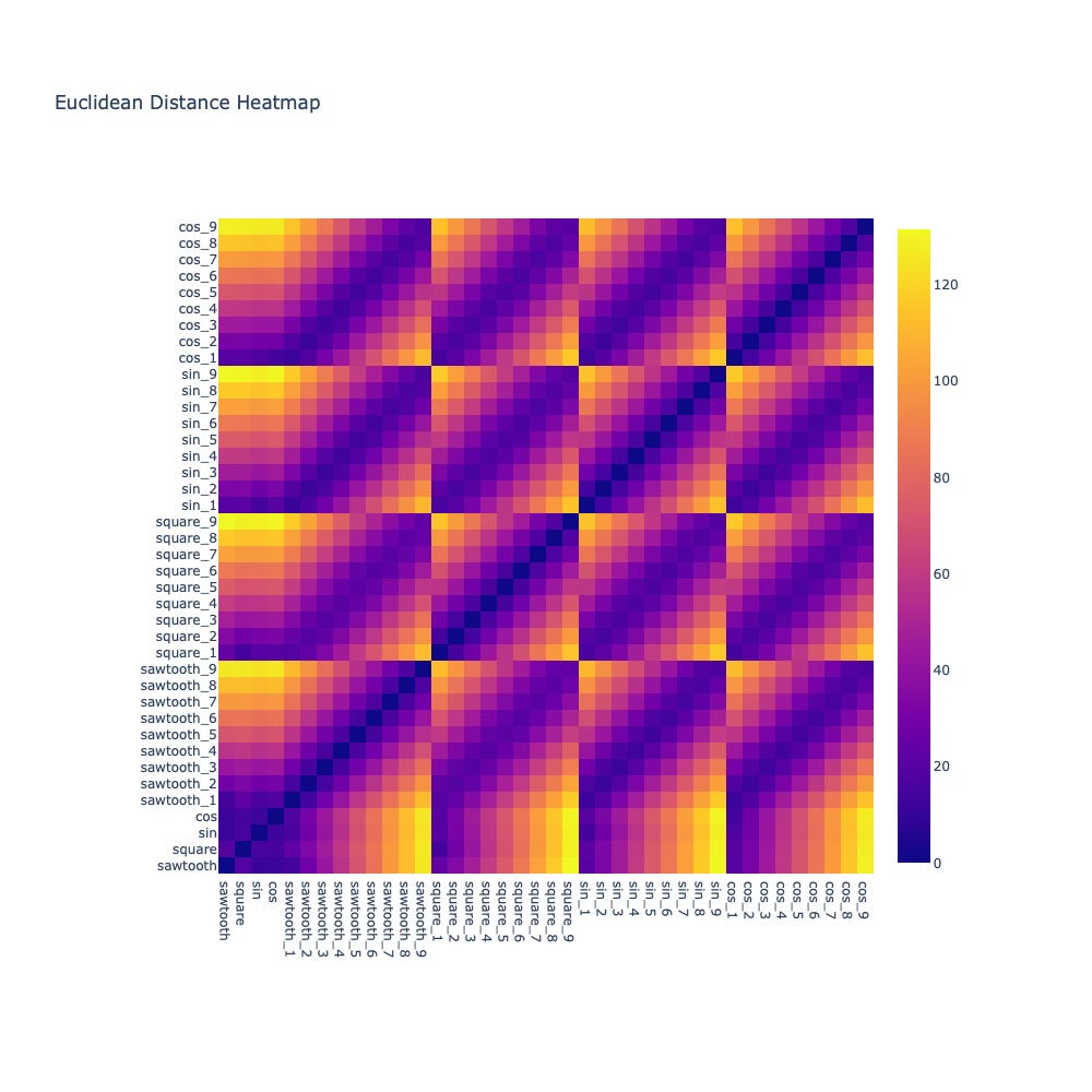
When we plot the Euclidean distance heatmap, a surprising pattern emerges:
Distances look uniformly noisy
Similar waveforms are not clearly separable
Structure is almost impossible to infer
This aligns perfectly with our intuition from Part 1.
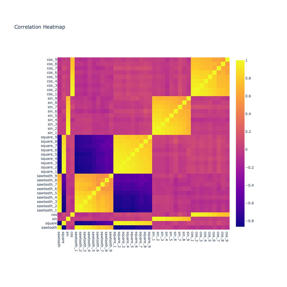
Now contrast that with the correlation-based distance heatmap.
Suddenly:
sine waves strongly correlate with sine waves
square waves cluster cleanly together
unrelated shapes show near-zero correlation
Without changing the data — only the metric — the structure becomes obvious.
Why Correlation Distance Works Better for Shape-Based Time Series Clustering
Correlation focuses on:
relative movement
shared periodicity
shape alignment
It is largely invariant to:
vertical shifts
linear scaling
This makes it a natural fit when your goal is to group time series by behavior, not magnitude.
But this introduces a new problem.
I’ve seen this exact failure mode repeatedly in production time-series systems — from sensor analytics to behavioral telemetry — where Euclidean distance produces visually meaningless clusters that still pass numeric validation checks.
How to Choose the Number of Clusters in Time Series Clustering
Even with a good distance metric, clustering still involves a hard question:
Where do we draw the boundary between “similar enough” and “different”?
Manually picking thresholds from heatmaps doesn’t scale.
It’s subjective, fragile, and error-prone.
This is where silhouette score enters — and changes the workflow from heuristic to objective.
👉 Coming next in Part 3:
At this point, most teams make their next mistake: eyeballing heatmaps and manually guessing the number of clusters. In Part 3, I’ll show how silhouette score eliminates this guesswork — and how I use it in production to prevent false cluster confidence.
Subscriber-only insight (Part 3):
I’ll share concrete production heuristics I use to decide:
when correlation-based clustering fails
when Euclidean distance is actually acceptable
and how to detect misleadingly “clean” clusters before deployment